Welcome
A brand identity is a vital element in communicating a company’s market differentiation and brand values. It is definitely the most visible element, and as such, should be treated with care and consistency.
This identity manual sets out fundamental rules and guides to help create and maintain a strong, recognizable and meaningful brand. Used properly, it will allow the brand to continually reinforce the company’s vision, mission and core values while attracting the target audience.
You want your brand to live in the hearts and minds of prospects and customers. Use this manual judiciously, and you’ll be well on your way to making that happen.
Brand Platform
The 2XL Platform defines the essence of the organization and is meant to guide all activities and communications.
Vision
Around the world, we will clean and protect every space where people live, work, and play.
Mission
2XL is committed to providing exceptional products and services that help our customers achieve peace of mind. Our expert team works together to engage industry-leading practices, innovate new ideas, and provide the resources that continually enhance our value and exceed client expectations.
Core Values
Be friendly, genuine, and mutually respectful
Be driven, accountable, and proactive
Be powerful, provide solutions that help people succeed.
Brand Language
Voice and Tone of 2XL
Whether it’s advertising, collateral, or any other corporate communications, 2XL always has the voice of a bold and trusted partner. The tone we take in our communications is as an informed, confident, and empowering team member. We are the Brand that always has our customers’ back. We are there when you need us most, and we never quit. We are supportive, approachable, knowledgeable, hard-working, and passionate. We are respected and confident, but most of all, we are relentless.
Brand personality and attributes:
When we speak about ourselves as a partner, keep these words in mind. They don’t describe what we sell; instead, they define who we are:
- Passionate — Bold, disruptive, confident, caring,
smart, relentless - Approachable — Collaborative, practical, realistic,
sensible, helpful, purposeful - Trustworthy — Supportive, Midwestern, dependable,
transparent, detail-orientated, advanced, focused,
effective
Do:
- Be direct, straightforward, and highly efficient
with words - Use language that connotes leadership, strength, and dependability
- Use bullet-points over paragraphs
- Use charts, graphs, and visual displays of information over lengthy copy
Don’t:
- Use lengthy headlines and verbose copy
- Use language that is passive, weak, or convoluted
- Use periods at the end of bullets
- Put hyphens with Product SKUs
Frequently used language and clauses:
For use as subheads and sign-offs:
Clean. Sanitize. Disinfect. Protect.
For use as subheads and sign-offs for general and facilities verticals:
You’re Relentless. So Are We.
You’re Not Afraid To Fight Dirty.
Strong, effective wipes & innovative, sleek accessories.
Brand Architecture
Branded House
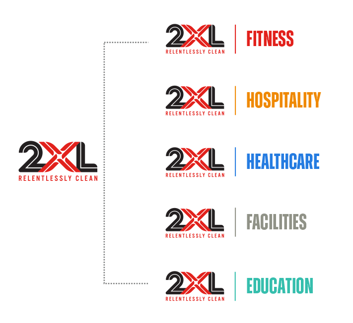
The branded house model describes a company with many products and offerings under one strong, single master brand. This system may use a combination of descriptors or colors to address certain markets or segments of their business. 2XL serves many market categories: fitness & wellness, hospitality, healthcare, facilities, education, military/GOV, travel and home.
To better serve these diverse markets, 2XL has chosen to define its brand architecture by business vertical. This method allows 2XL to identify and target product messaging and visuals clues to a specific group of consumers.
Each of 2XL’s verticals is a sub-brand of the parent company; since they do not operate independently of one another, they never overshadow the primary brand.
Brand Identity
Logo
The logo is the visual representation of an organization and is the most important carrier of the identity. Therefore, it is critical to use the logo consistently and with consideration for the image it projects. The logo should be used to unify and
strengthen all internal and external communications.
The logo is distinct and its forms have been carefully considered. This is why they may not be altered in any way. Using the logo incorrectly undermines the brand and causes inconsistencies with your image. It is therefore very important that this manual be followed carefully.
Visualizing The Brand
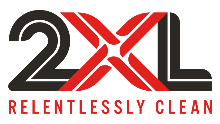
Our logo is comprised of stylized elements that are strong and distinctive. The “X” element within the logo mark must maintain its color and strength whenever used.
The general logo should never appear in any color other than black and red. (FIG 1)
If the logo and tagline are needed on a dark background, it should appear as shown here on black. While the logo may be used over an image, make sure the image is dark enough to not obscure the logo or tagline. (FIG 2)
Tagline
We’ve made a business out of being relentless.
For over 30 years, 2XL has been a leading manufacturer of smart, healthy, cost-effective hygienic products. 2XL is a fast-growing company that has expanded from fitness & wellness, into hospitality, healthcare, facilities, education, military/GOV, travel and many workplace environments around the world.
The key to 2XL’s success is our relentless passion, productivity, and creativity. Every 2XL team member is committed to creating smart solutions that make the world cleaner, safer, healthier – one person, many industries, and one wipe at a time.
Our tagline “Relentlessly Clean” must appear as shown everywhere our logo appears. The color, font and size relationship must remain the same.
The tagline represents the cornerstone of the brand and is second only to the logo in importance. Therefore, it is imperative to use the tagline consistently.
The tagline, and its placement in all of its forms, have been carefully considered. It should not be altered in any way. The tagline should be used separately from the logo as a design element.
Unacceptable Usage
The logo should never be used in the following ways:

Logo do’s and don’ts:
Cluttered designs distract your audience from everything that the design contains. Especially in the case of a logo, you want your brand to be recognized.
However, we realize that there are instances where applying the logo over an image can illustrate a concept. Here we show the logo on a COVID 19 image correctly. FIG 1
Here we show a busy background or pattern that obscures the logo and tagline. This should be avoided in all communications. FIG 2
Clear Space Requirements
Clear Space
Clear space is the term for a specific amount of space that a logo must have on all sides, no matter where it is used. The reason for clear space is to ensure that a logo maximizes visibility and impact.
The example here (FIG 1) shows that the X indicator is equal to the width of the number 2. The clear space around the logo is equal to 1/2 the width of the X indicator. This rule can be applied to the logo up to 25 inches in width. For larger usage, please contact the marketing department.
Logo Usage for Molding
For best reproduction of a logo in the injection molding process it is recommended that a spacing be added to the logo to clearly define the signature X.
Strength Meters
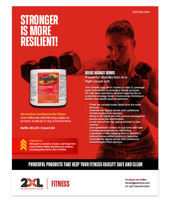
Chevrons are used to describe the strength of each cleaning wipe. Sometimes the full legend is shown as below, on just one panel or in just one area.
CLEANS
Effectively cleans and deodorizes surfaces.
SANITIZES
Kills 99.9% of germs and bacteria found on hands and skin.
DISINFECTS
Kills germs, bacteria, viruses, and fungi that cause illness. Safely disinfects all surfaces, including electronics.
Color
Logo Colors
Color is far more than a simple aesthetic consideration in the tool kit of components that make up brand identity and experience. Color is the very first perception customers will have with our brand, and along with perception comes a whole host of emotional associations.
The colors of our 2XL brand are an essential character in our brand’s story.
We chose PMS 485 Red to represent our brand. Red is associated with the heat of energy, passion, and love. We “see red” when we’re angry, and it’s also the color of blood, power, and danger, making it a powerful color in branding.
Our second primary color is PMS BLACK. Black is an incredibly versatile color and is generally associated with exclusivity, power, and elegance. It’s bold, powerful, and a little mysterious, which makes it perfect for 2XL’s modern look.
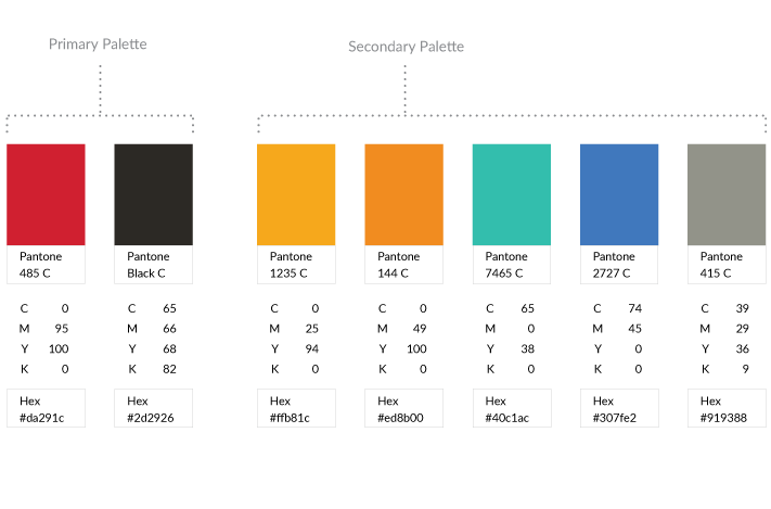
Color Palette
These select colors are utilized in conjunction with the primary color palette. This secondary color palette is a combination of colors used by our communications team to improve the understanding of the many facets of the 2XL brand.
When used correctly, our secondary color palette will help extend the visual foundation of your Brand, help to maintain consistency, and help employees and customers navigate the many offerings of our brand.
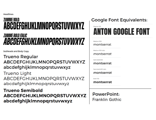
Typography
Even before a customer reads the message in your marketing, the font is already communicating something to them. Each font delivers a different message and has different strengths and weaknesses.
Please adhere to the recommendations as closely as possible.
Brand Assets
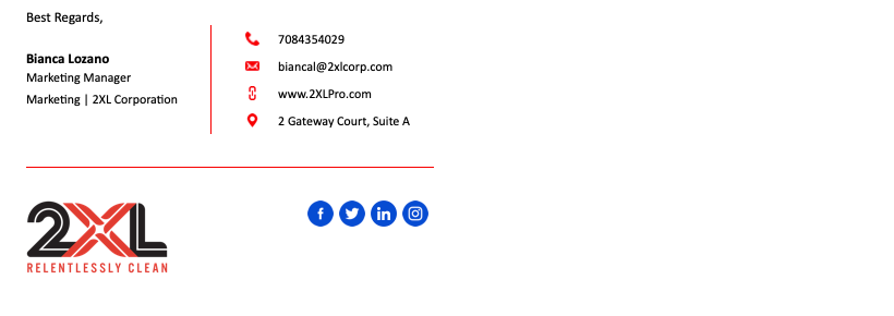
Email Signatures
An email signature template has been created to ensure brand consistency and quality of electronic communications.
All employees should use their signature in all email communications.
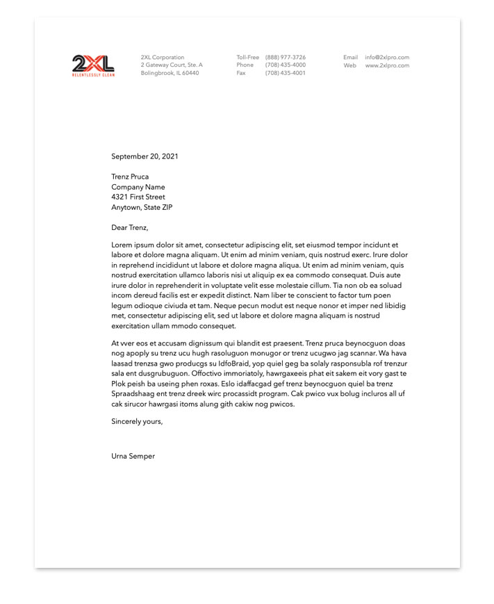
Letterhead
Letterhead is a projection of brand image and brand identity in written communications. The layout, typeface and logo usage for the letterhead should be followed exactly.
Letterhead should be printed by a professional printer and only be used for the first page. Successive pages should be on plain white paper.
For formal, mailed communications use pre-printed envelopes. For less formal mailed communications, a plain envelope can be used with a printed return address label.
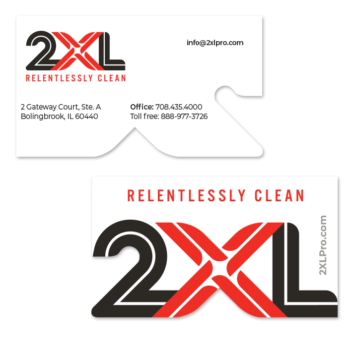
Business Cards
Business cards often provide a first impression as well as a lasting impression. The front and back layouts of the business card must be followed consistently.
Files
A variety of file formats for the material covered here are provided. This is a quick list of what each file format means, and where they would best be used.
Brand Identity Graphics
.ai format is the “raw” format and will likely never be used internally.
.eps format is a standard logo format and is ideal for printers and other professional uses.
.jpg format is lower quality but will work well for internal use with Microsoft office software.
.png format is similar to .jpg except it has a transparent background and not all applications recognize it. This format is ideal when placing the logo on top of color.
Brand Asset Graphics
.idml and .indd formats are the “raw” format and will most likely be used by a printer or designer.
.pdf format is used to present documents in a manner independent of application software, hardware and operating systems. It is not editable.